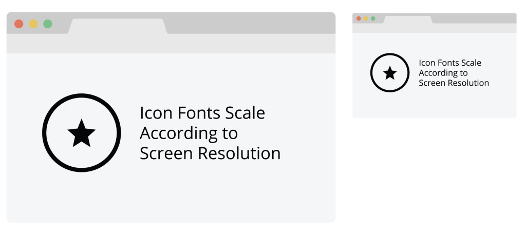
What are icon fonts?
Icon fonts are a collection of .SVGs (scalable vector graphics) that can be loaded into your html and used as a font, where characters represent icons. We started using icon fonts and found them to be more efficient compared to the alternative – dreadful .PNG sprites.
Why Icon Fonts?
Because icon fonts are made up of .SVGs, there are several benefits to using them…
- Scalability: No more creating 1x and 2x sizes for everything! Each individual icon within an icon font set can be scaled according to the site design in CSS. Easy peasy. Even better, the icons will scale according to screen resolution so whether you are on a regular or retina display, rest assured that your icons will look crisp and clean.

- Flexibility: Not only do .SVG icons let us easily adjust their size, but using .SVGs also means we can apply other CSS styles to them that we normally wouldn’t be able to apply to a .PNG icon – or at least not as nicely. Shadows, gradients, outlines – anything you can do to a font or shape in CSS you can apply to your icon font characters.

- Fast: One http request allows for a speedy load time!
- Accessibility: Screen readers are compatible with icon fonts as long as you code them correctly (for more on this, see Making a Font)
- Compatibility: Works well across browsers (including IE7 & IE8!) and devices (phone, tablet, desktop, you name it!)
- Efficiency: From a design perspective, creating the icons becomes a much more precise process, utilizing the grid for pixel perfect icons where color and size no longer apply. From a development perspective, implementation is much smoother without having to fuss with sprite coordinates or doing double work for retina displays.
- Management: In our experience with IcoMoon, managing icon fonts has been a breeze. From adding new icons to a font, updating existing icons, or spinning up a new font entirely, we’ve mastered our internal process, seamlessly passing along icon fonts among designers for creation and over to developers for implementation.
There are however a few downsides…
- Any designer would want the ability to simplify an icon when scaled down, and provide more detail or a change in line weight when increased in size. When using icon fonts, your icons will be the same design whether they are 16px or 160px, which in turn is beneficial to icon consistency regardless of size, but could create a legibility issue.
- Icons can only be a single color – you can place icons on top of a colored shape or, as mentioned above, apply CSS styles like multi-colored gradients, but at the end of the day icon fonts can only be one color. For more complex icons, you may want to consider using .SVGs (with a .PNG backup for IE of course).
Aside from these minor flaws, icon fonts are pretty universal. We have found that implementing them has improved our internal process, providing a more efficient way of creating optimized (and aesthetically pleasing) icons.
Creating an icon font and not sure where to start? Check out our icon font guideline here – we’ll walk you through how to create icons using Illustrator and how to import your icons into IcoMoon to create a font!
Here are some additional icon font references:
IcoMoon has some great documentation on creating and implementing icon fonts as well.